


Maximalism, Color, & Mixing Patterns
Maximalism, Color, & Mixing Patterns
Between more and less
The internet fed me a striking slogan recently: “More is more and less is a bore.” This declaration accompanied a photo of a heavily patterned room, one draped with rich textiles and colors. Although attracting my attention and even persuading me for a moment, I hesitated to accept such a premise. These kinds of absolute statements always signal my skepticism. Of course, their intensity is just a sales pitch, but I bristle, and I want to dig a bit. What is “more” exactly? What is “less?”
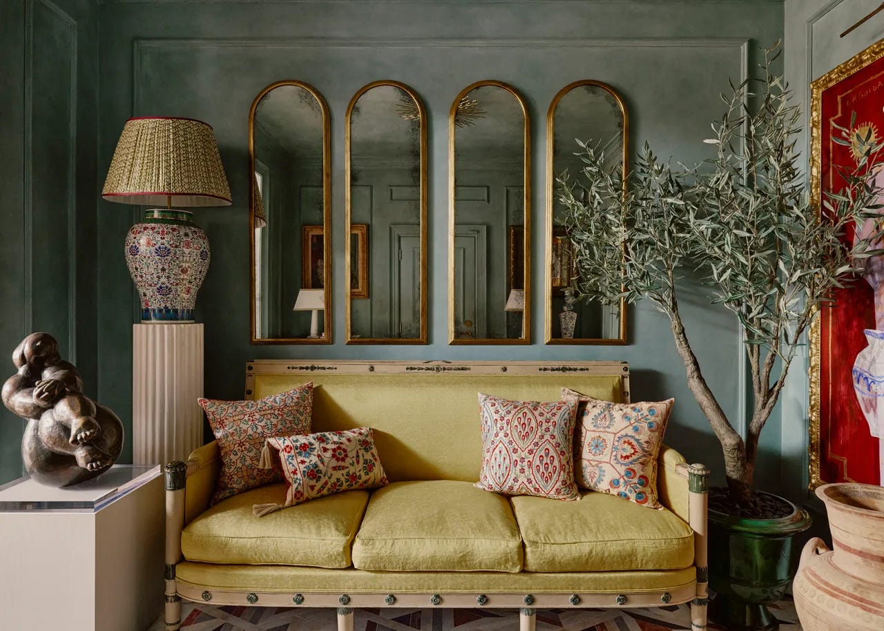
In the last few years of interior design, the “more” of maximalism has returned. To some extent, it has always been practiced by designers within a subset of classic and traditional style, but now it is generally acknowledged as a full-fledged trend—a look that more and more brands are incorporating. Beginning with a renewed appreciation for vintage and antiques and older periods within design, this movement has risen to a become a widely encouraged and valued aesthetic, now to the point that it is marketed as a lifestyle: bold patterns, bright color, ornate furniture and décor, dense gallery walls.
On the one hand, this is a return and maybe a healthy one. Some of us felt a bit corseted by the strong minimalism that mainstream brands promoted for a few years, the hesitation with color, the avoidance of detailed pattern. Renewed appreciation for timeless lines, patterns, and textiles seems to be a way of honoring historical artistic moments in interior design. It also offers an opportunity to explore color, scale, and balance and to integrate, maybe, a more playful mood into your home.
On the other hand, maximalism causes a few of us pause. For example, for the serious, its apparent promotion of having lots of stuff presents a philosophical issue: What happened to the beauty of simplicity? Underneath this question and partially masked by it may be a more practical one: How do you create a maximalist space? The number of patterns and elements is daunting even if not desirable. Or, maybe, neutrals are what you love.
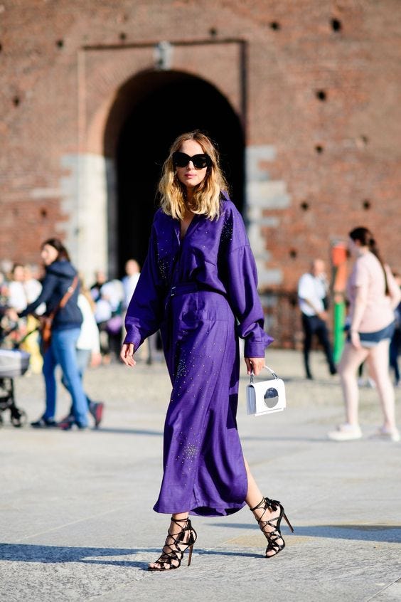
In light of this conversation, the history of color versus neutrals is interesting to consider. A sign of wealth and prominence, colorful pigments and dyes used for clothing and furnishings were expensive until the late 1800s. Purple, we know, is associated with royalty, because it was one of the hardest colors to come by. In the time of the Ancient Romans, it was made from the gland of a snail, and every piece of purple clothing required thousands of snails.
People of lower and even middle classes could afford few if any colorful pieces. Their wardrobes and homes were the color of their cloth, although they may have also made their own dyes from materials they found. Still, these were limited and less vibrant, and the phrase “less is a bore” becomes a bit uncomfortable, at least for me.
All this shifted, however, when a young medical student accidentally made the color mauve during an experiment in 1858. The frontier of manufactured colors broke upon the world.
Colors and pattern-mixing appeal to me because of their creative opportunities. There is so much room for play. However, understanding how to create a room that tends maximalist took me a while, especially with a budget. Interestingly, it still holds true that classic fabrics and cuts call for a higher investment, and so I am always looking for attractive, high-quality textiles, from tablecloths to thrifted clothes. The key here is to see fabric as fabric and not as the piece it has been sewn to be. A sheet can be a curtain. A duvet can be a dress. A tablecloth can be a Roman shade. I also make note of discount upholstery fabric stores that sell what the larger outlets could not.
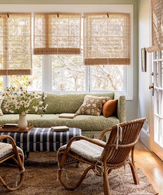
Mixing patterns comes down to visual balance and a decided color scheme. Designers often recommend pairing geometric fabrics with organic or floral ones. I like to then incorporate a third patterned fabric with a different scale than one of the first two. To bring in some calm, add in a solid fabric. To add a bit of maximalism, go for another large-scale pattern as well. Make sure each fabric includes similar colors, and they are likely to harmonize.
Everyone says there are no rules, which is not always helpful, so I’d suggest starting here, whether you’re choosing the upholstery for a room, the pillows for a couch or bed, or even different elements of an outfit. As you gain confidence and lightheartedness, you might try new combinations. I like to pair fabrics of similar scales but wildly different patterns, like a floral with a Greek key design. A bunch of differently scaled linear patterns can also be interesting, again, as long as the colors speak to one another.
(As a side note, designers usually choose their fabrics before they choose wall colors! They let the textiles determine that.)
Mixing patterns can be an element of maximalism, but I appreciate that this integration of color and scale actually moves beyond the trends of supposedly “less” and “more” and into the realm of the personal. If you tune into the patterns and colors you love, the ones that mysteriously catch your eye, and begin to pair them together, you will craft something entirely new. One fabric may lean funky and modern whereas another hearkens toward tradition, and few others will think of this exact combination. “Everyone” might be a tiny bit right here; believing that there aren’t any rules may free up the playfulness.
You might choose a neutral for your walls to make your other colors pop or a bright, complementary color to drench the room. Or go for a neutral maximalism! Minimalist and colorful!
Unfortunately, more for the sake of more may just be more. Less may just be less. Both could be boring. But attunement to the interiors that calm and cheer you, that nourish your soul, and a patient progress toward them—whether with many patterns or a few (or only solid colors)—will feel just right.
Great article. Sometimes less is more also. I have to remember that from time to time when making my fiberart pieces